Published
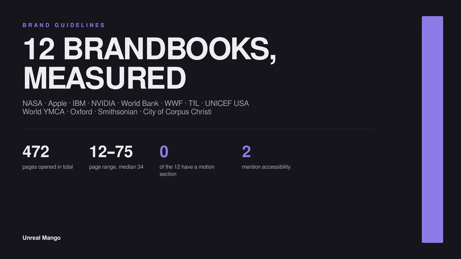
Brand guidelines examples are easy to find and hard to learn from, because almost every published list shows you screenshots instead of contents. So we downloaded twelve official brandbooks and measured them: 472 pages in total, 12 to 75 pages each, median 34. Below is what is actually inside them — and what almost none of them bother to include.
How this was checked. On 2 August 2026 we downloaded twelve brand guideline documents published free by the organisations themselves, opened each one programmatically, and recorded page count, page format, word count and which named sections appear in the table of contents. Every number below comes from the file, not from a summary of it. Documents reposted on slide-sharing sites were excluded; only files served from the organisation’s own domain were counted.
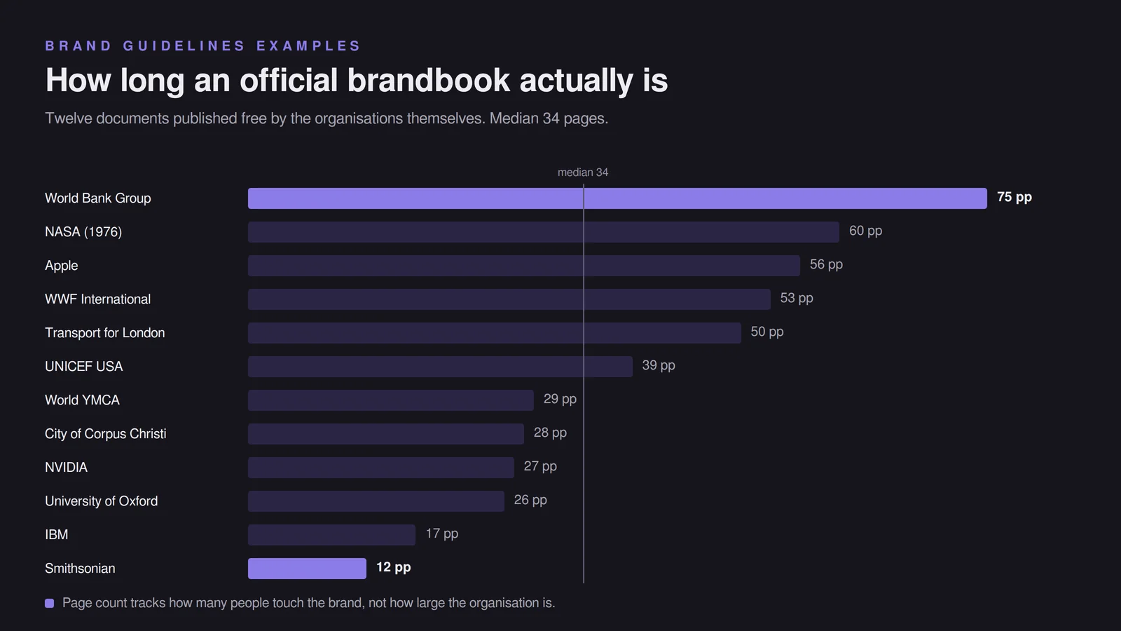
The 12 brand guidelines examples, measured
| # | Organisation | Document | Pages | Page format | What it is really about |
|---|---|---|---|---|---|
| 1 | World Bank Group | Branding and Visual Identity Guidelines (2016) | 75 | Portrait, letter | Five institutions sharing one mark |
| 2 | NASA | Graphics Standards Manual NHB 1430.2 (1976) | 60 | Portrait, oversize | Reproducing one logotype without a computer |
| 3 | Apple | Identity Guidelines for Channel Affiliates | 56 | Portrait, A4 | Resellers putting Apple on a shopfront |
| 4 | WWF International | Editorial Style Guide (2022) | 53 | Portrait, A4 | Punctuation, numbers and spelling |
| 5 | Transport for London | TfL brand IP guidance | 50 | Landscape, 16:9 | Who may sell a roundel mug |
| 6 | UNICEF USA | Brand Guidelines v1.0 (2017) | 39 | Landscape, letter | Sub-brands and partner lockups |
| 7 | World YMCA | Visual and written identity (2025) | 29 | Landscape, 16:9 | A federation of local branches |
| 8 | City of Corpus Christi | Design and Brand Guidelines (2025) | 28 | Landscape, 14×8.5 in | Departments that all make their own flyers |
| 9 | NVIDIA | Partner Co-Branding Guidelines | 27 | Landscape, A4 | A logo on someone else’s box |
| 10 | University of Oxford | Schwarzman Centre visual identity (2020) | 26 | Landscape, A4 | A sub-brand borrowing a 900-year-old one |
| 11 | IBM | Logo and Brand Guidelines for Third Parties | 17 | Landscape, 16:9 | Trademark law, illustrated |
| 12 | Smithsonian Institution | Identity Guidelines: Website Applications | 12 | Portrait, letter | One channel only — the web |
Two numbers are worth pulling out of that table. The average document carries 139 words to the page, ranging from 58 at Transport for London to 274 at NASA. And the format split is almost even: five portrait documents against seven landscape ones. Both facts point the same way — a brandbook is not a document anyone reads front to back. It is a reference someone opens at one page, on a screen, to settle one argument.
Corporate brand guidelines examples: Apple, IBM and NVIDIA
Apple, 56 pages. The longest corporate document in the set, and it contains no colour palette at all: zero Pantone, CMYK, RGB or HEX values across 56 pages. Twenty-one of its 56 pages govern physical retail — facade signage, window clings, sign illumination, interior fixtures, banners. The clear space rule is unusually generous and unusually specific: half the height of the Apple logo, measured from the top of the leaf to the lower edge. Take this: the “avoid these mistakes” pages, which appear seven separate times, each tied to the context it applies to rather than pooled into one generic don’ts page.
IBM, 17 pages. The tightest document here and the clearest about what it is for — it exists so other companies can say “works with IBM” without misrepresenting the relationship. No typography section at all, no photography, no voice. Its clear space rule is the cleanest in the set: X equals the height of the letter I in the IBM logo. Take this: the framing. A short guide aimed at outsiders beats a long one aimed at nobody in particular.
NVIDIA, 27 pages. A partner co-branding manual built around one recurring device, a coloured band that partner materials must anchor to. Its unacceptable-usage spread is the most thorough we found, running to more than a dozen labelled violations. Minimum sizes are given in three units at once — 0.35 in, 9 mm, 38 px for the vertical lockup; 0.12 in, 3 mm, 15 px for the horizontal. Take this: stating sizes in print, metric and pixel units so nobody has to convert and guess.
Nonprofit and institutional brand guidelines examples
World Bank Group, 75 pages. The biggest document in the set, and the reason is structural: it has to hold five institutions under one mark, so a full third of it is logo hierarchy, member-institution brands, entity lockups and partnership tiers. It carries more than fifty separate colour code references. Take this: the three-category partnerships-and-products system, which decides in advance how much visual space a partner earns.
WWF International, 53 pages. The most useful outlier in the set. Fifty-three pages that mention the word logo exactly zero times, contain no palette and name no typeface. It is entirely about writing: apostrophes, en-rules, species names, how to write percentages, when to spell a number out. Take this: the fact that it exists at all. Most brands write far more words than they draw logos and govern only the logo.
UNICEF USA, 39 pages. Built for a monolithic brand architecture, with a long section on partnership lockups — one partner, multiple partners, tiered partners, “in support of”. Clear space is stated as a formula — the width of the letter u, or 15 px on digital — and then baked into the supplied files anyway. Take this: shipping logo files pre-padded, which removes the most commonly broken rule by removing the need to apply it by hand.
World YMCA, 29 pages. Published December 2025 and the most modern in shape: visual identity and written identity in one document, eight HEX values, Inter as the typeface, social media samples per platform, and a downloads page linking PowerPoint, letterhead and email signature templates. Take this: the templates page. A federation of branches will not rebuild a letterhead from a spec; it will use whatever file it can open.
University of Oxford (Schwarzman Centre), 26 pages. A sub-brand identity: how a new centre expresses itself as a partner brand of a much older one. Notable for including a writing style section, which only two other documents here do. Take this: the explicit partner-brand framing, useful for any business running a second name alongside its main one.
Smithsonian Institution, 12 pages. The shortest and the most single-minded: web branding standards only, with a single HEX value in the whole file — #101820 — and a direct reference to WCAG 2.0 contrast requirements. Take this: scoping a guide to one channel instead of pretending to cover all of them badly.
Public-sector brand guidelines examples: NASA, TfL and a Texas city
NASA, 60 pages, 1976. Nine sections: logotype, reproduction art, stationery, forms, publications, signage, vehicles, miscellaneous, supplementary guides. It is the densest document in the set at 274 words per page, and it contains no colour codes whatsoever — it was written for a world where reproduction meant photographic artwork, not a file. Take this: the grid drawings for large applications. It answers “how do I make this enormous and still correct”, a question most modern brandbooks skip.
Transport for London, 50 pages. Not a design manual at all but an intellectual-property guide: what TfL brand IP is, the categories of third-party use, and the rules for filming and content creation. At 58 words per page it is the sparsest document here. Take this: the categories-of-use structure, which sorts requests before they reach a human.
City of Corpus Christi, 28 pages, updated September 2025. Five numbered sections — logo system, department logos, colour, typography, graphics — plus the most complete accessibility treatment in the set: colour contrast, alt text, closed captions and social media ADA compliance. Clear space is a plain ratio: one quarter of the logo height. Take this: the accessibility pages. It is a small municipal document doing something eleven larger ones do not.
What every brand guidelines example contains, and what almost none of them do
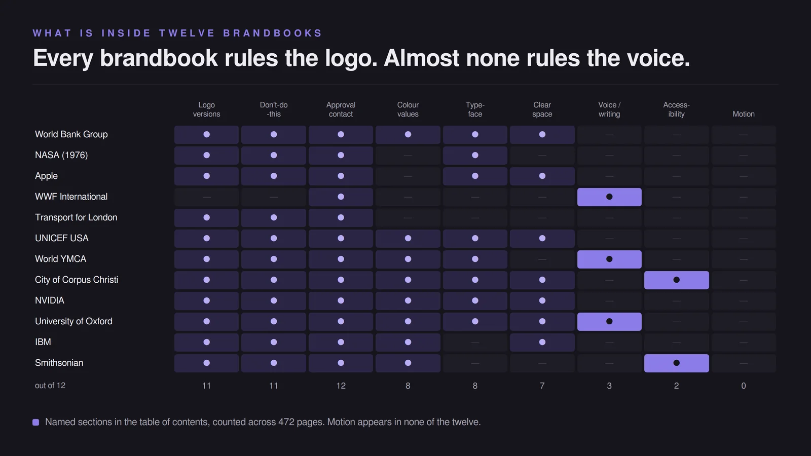
Across twelve documents, only two things appear every single time.
| Section | Present in |
|---|---|
| A named contact or approval route | 12 of 12 |
| Logo versions and how to place them | 11 of 12 |
| A don’t-do-this page | 11 of 12 |
| A colour section with printed values | 8 of 12 |
| A typography section naming a typeface | 8 of 12 |
| An explicit clear space rule | 7 of 12 |
| Templates or downloadable files | 5 of 12 |
| Social media application | 4 of 12 |
| Voice or writing rules | 3 of 12 |
| Photography or imagery direction | 2 of 12 |
| Accessibility | 2 of 12 |
| Motion or animation | 0 of 12 |
Three things stand out. Motion appears in none of the twelve as a named section, which is remarkable given that most of these brands publish video weekly. Accessibility appears twice, and in both cases from a public body rather than a company. And voice appears three times — once as an entire 53-page document and twice as a short section — which means nine of twelve brands govern how their name looks and say nothing about how it sounds.
The second pattern is about audience. Four of the twelve documents exist entirely for outsiders: Apple’s is for resellers, IBM’s and NVIDIA’s for partners, TfL’s for licensees. Three more devote a named section to partner or co-branded use. So seven of twelve spend real page count on somebody else using the mark, not on the brand’s own designers. If you have ever wondered why a downloaded brandbook felt oddly legalistic, that is why — you were reading a permissions document.
Clear space rules compared across seven brandbooks
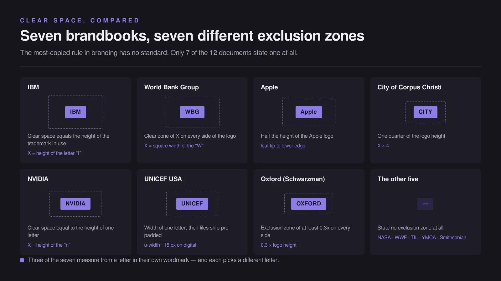
Only seven of the twelve state an explicit exclusion zone, and no two define it the same way. This is the single most copied rule in branding and there is no standard for it.
| Brandbook | The rule | Unit of measurement |
|---|---|---|
| IBM | Clear space equals the height of the trademark in use | Height of the letter “I” |
| World Bank Group | Clear zone of X on every side | Square width of the “W” in the logotype |
| Apple | Half the height of the Apple logo | Leaf tip to lower edge |
| City of Corpus Christi | One quarter of logo height | X ÷ 4 |
| NVIDIA | Clear space equal to the height of the “n” in the wordmark | Height of the letter “n” |
| UNICEF USA | Width of the letter “u” in the wordmark, then pre-padded files | u-width; 15 px on digital |
| Oxford (Schwarzman) | Exclusion zone of at least 0.3x on every side | 0.3 × logo height |
Three of the seven derive the zone from a letter in their own wordmark — and each picks a different letter. The practical lesson is that the ratio does not matter much; committing to one and writing it down does. UNICEF USA’s is the most robust of the seven, because it states the rule and ships the files pre-padded as well, so the measurement rarely has to be applied by hand.
What a small business actually needs from a brand style guide
The median document here is 34 pages. A business with fewer than twenty people needs roughly one, and the reason is in the teardown above: most of that page count exists to coordinate departments, member institutions and licensees. You have none of those. What you do have is the moment a printer, a freelancer or a marketplace listing puts your name on something without asking you first — and that is what the one page is for.
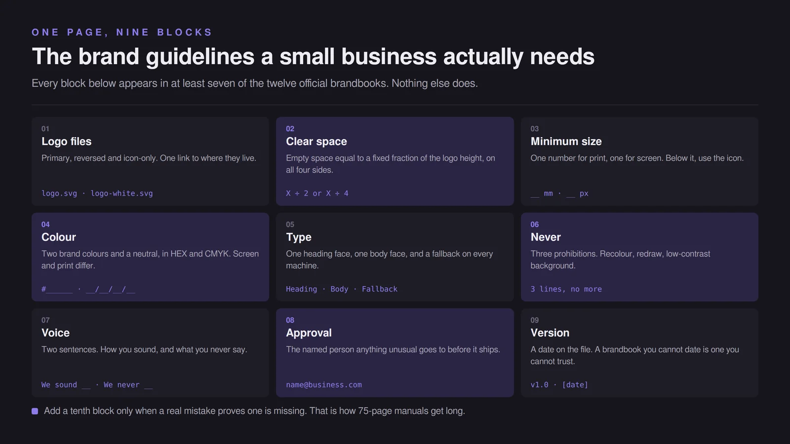
Six answers cover it. Which logo files exist and where they live. How much space goes around the mark, as a fraction of its own height. Your colours in HEX and CMYK, because screen and print need different ones. One typeface, plus a fallback that exists on every computer. Three things nobody may do. And the name of the person who approves anything unusual. Every one of those six appears in at least seven of the twelve official brandbooks; nothing else does.
Note what is not on that list: anything about how to commission design work. That belongs in a design brief, which goes in before the work starts. Guidelines are what comes out of it, and confusing the two is why so many small brands end up with a document that is half wish list and half rulebook.
Add a seventh line if you sell anything with words on it: two sentences on how you write. WWF spent 53 pages on that and it is still the most-copied part of their identity.
If you would rather have this designed properly than assembled from a template, that is what our branding work covers — but the one-pager below will hold the line until then, and it is better than nothing by a wide margin.
A one-page brand guidelines template you can fill in an afternoon
Copy this, replace every bracket, export it as a PDF, and send it with your logo files. It maps to the six sections that survive in almost every official brandbook.
[BUSINESS NAME] — BRAND BASICS
Version [1.0] · [date] · Questions: [name, email]

1. LOGO FILES
   Primary: [filename.svg] — use everywhere by default
   Reversed (light on dark): [filename-white.svg]
   Icon only: [filename-mark.svg] — only when the full logo is under [size]
   All files live at: [link or folder]

2. CLEAR SPACE
   Keep empty space equal to [half / one quarter] the height of the logo
   on all four sides. Nothing enters it — not text, not an edge, not a photo.

3. MINIMUM SIZE
   Print: [__] mm tall.  Screen: [__] px tall.  Below that, use the icon.

4. COLOUR
   Primary   [Name]  HEX #______  CMYK __/__/__/__
   Secondary [Name]  HEX #______  CMYK __/__/__/__
   Neutral   [Name]  HEX #______
   Text on brand colour must stay readable — check contrast at 4.5:1.

5. TYPE
   Headings: [Typeface, weight].  Body: [Typeface, weight].
   If unavailable: [system fallback, e.g. Arial / Georgia].

6. NEVER
   - Do not recolour, stretch, rotate or add effects to the logo.
   - Do not rebuild the logo in a font or redraw it.
   - Do not place it on a busy photo or a low-contrast background.

7. VOICE (two sentences)
   We sound [__]. We never say [__].

8. APPROVAL
   Anything not covered here goes to [name, email] before it is printed,
   posted or published.
That is the whole thing. Nine blocks, one page, and it settles the arguments that actually happen. When a real mistake proves a section is missing, add that section — which is how every 75-page manual in this teardown got long in the first place.
Where brand guidelines examples mislead a small business
Three traps, all of them created by looking at famous brandbooks and copying the shape instead of the content.
Length signals nothing. The 12-page Smithsonian document and the 75-page World Bank one are both fit for purpose, because they cover different amounts of surface. Copying the page count of a brand with 50 departments produces a document you will never update, and an out-of-date brandbook is worse than none — people follow it, and it is wrong.
Most of what you are admiring is a permissions document. Seven of twelve are substantially about other people’s use of the mark. If you have no resellers, no partners and no licensees, most of that page count solves a problem you do not have.
The prettiest examples are portfolio pieces, not working documents. The gallery listicles that dominate this search are largely populated by unsolicited student concepts and agency showcases. The twelve here are the opposite: dull, functional documents written to be used rather than admired. If you can only steal from one category, steal from the second — and then check whether the version you found is the current one, because three of these twelve have since been superseded (NASA 1976, NVIDIA 2011, Apple 2013), and a brandbook you cannot date is a brandbook you cannot trust.
10 / Reader questions
Frequently asked questions
01What are brand guidelines?
Brand guidelines are the rulebook that says how your brand may be reproduced: which logo files exist, how much space goes around them, which colours and typefaces are yours, what nobody is allowed to do, and who signs off. In the twelve official documents we measured, those five things account for most of the page count.
02How many pages should brand guidelines be?
Between 12 and 75 pages in the twelve official brandbooks we measured, with a median of 34. Page count tracks how many people touch the brand, not how big the company is: a 12-page Smithsonian guide covers websites only, while a 75-page World Bank manual has to govern five institutions and their partners.
03What should brand guidelines include?
Logo versions, a clear space rule, colour values, typefaces, a don't-do-this page and a named approval contact. Those six appear in almost every official brandbook we opened. Voice, photography direction, accessibility and motion appear far less often — three, two, two and zero times out of twelve respectively.
04Where can I download brand guidelines examples as PDF?
Most of the twelve documents in this teardown are published free by the organisations themselves — NASA, Apple, IBM, NVIDIA, the World Bank, UNICEF USA, WWF, Transport for London, the Smithsonian and the City of Corpus Christi all host their own PDF. Search the organisation name plus brand guidelines and take the file from its own domain rather than a repost.
05What is the difference between brand guidelines and a brand style guide?
Nothing consistent — the twelve documents we measured use brand guidelines, style guide, identity guidelines, graphics standards manual and visual identity guidelines interchangeably for the same content. The only real distinction worth making is scope: some cover the mark alone, some add writing, and one of ours covers writing and nothing else.
06Do small businesses need brand guidelines?
Yes, but one page of it. The moment a second person makes something with your name on it — a printer, a freelancer, a marketplace listing — you need written answers on logo files, colour values, typeface and what nobody may do. That fits on one page; the other 33 pages of a median brandbook exist for organisations with departments.
07How do you create brand guidelines?
Write down the decisions you have already made, in this order: logo files and where they live, clear space as a ratio of logo height, colour values in HEX and CMYK, one typeface with a fallback, three things nobody may do, and the person who approves exceptions. Add sections later only when a real mistake proves one is missing.