Published
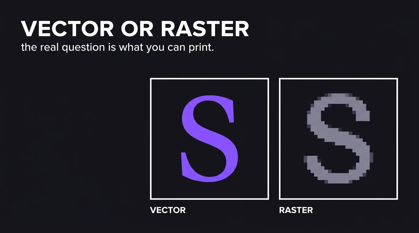
A raster image is a fixed grid of pixels. A vector image is a set of mathematical paths that redraws itself at any size. That difference decides one practical thing: whether your logo can go on a shopfront sign without looking like a screenshot. Everything below is about which file to ask for, and how to check you were given it.
The pixels-versus-paths explanation is the easy half, and it is already everywhere. The half that costs money is downstream: a sign maker, an embroiderer or an offset printer asks for a vector file, you forward what your designer sent two years ago, and it turns out to be a PNG in an EPS wrapper. Now someone is redrawing your logo by hand, guessing at your curves, and charging you for it.
How this was checked. For this query in the United States on 2 August 2026, Google returned an AI Overview, a video pack, an image pack and six organic results — five explanatory articles and one forum thread — and every one of them led with pixels versus paths. None published a per-deliverable format table, and none gave a procedure for verifying a file you have been handed. The failure mode appeared exactly once in the whole result set — in a comment on a commercial-printing forum thread, noting that PDF, AI, EPS and SVG can all contain raster elements. That gap is what this article fills.
Vector versus raster in one line, and the three moments the difference bills you
Vector scales, raster does not. Everything else follows from that.
- Raster stores a value for every pixel in a grid. Enlarge it and the software invents the missing pixels, which is why an enlarged raster looks soft or blocky. Photographs, screenshots and anything with real-world texture are raster by necessity.
- Vector stores instructions — this curve, this thickness, this colour — and draws them fresh at whatever size is asked for. Logos, icons, type, diagrams and line illustrations belong here.
The distinction stays academic until one of three moments arrives:
- Something goes large. A shopfront sign, a vehicle wrap, an exhibition stand, a billboard. There is no raster file big enough that a sign shop will not ask for vector anyway.
- Something goes into a production process that reads paths, not pixels. Embroidery machines, vinyl cutters, laser engravers and screen-print separations all need outlines to follow.
- Something has to change. New tagline, one-colour version for a stamp, a variant that fits a square avatar. From vector these are minutes. From a flattened PNG they are a redraw.
If none of those three ever happens to your brand, the file format genuinely does not matter. In practice, the first one always happens eventually, and it happens on a deadline.
Which file format each deliverable needs, from a shopfront sign to a favicon
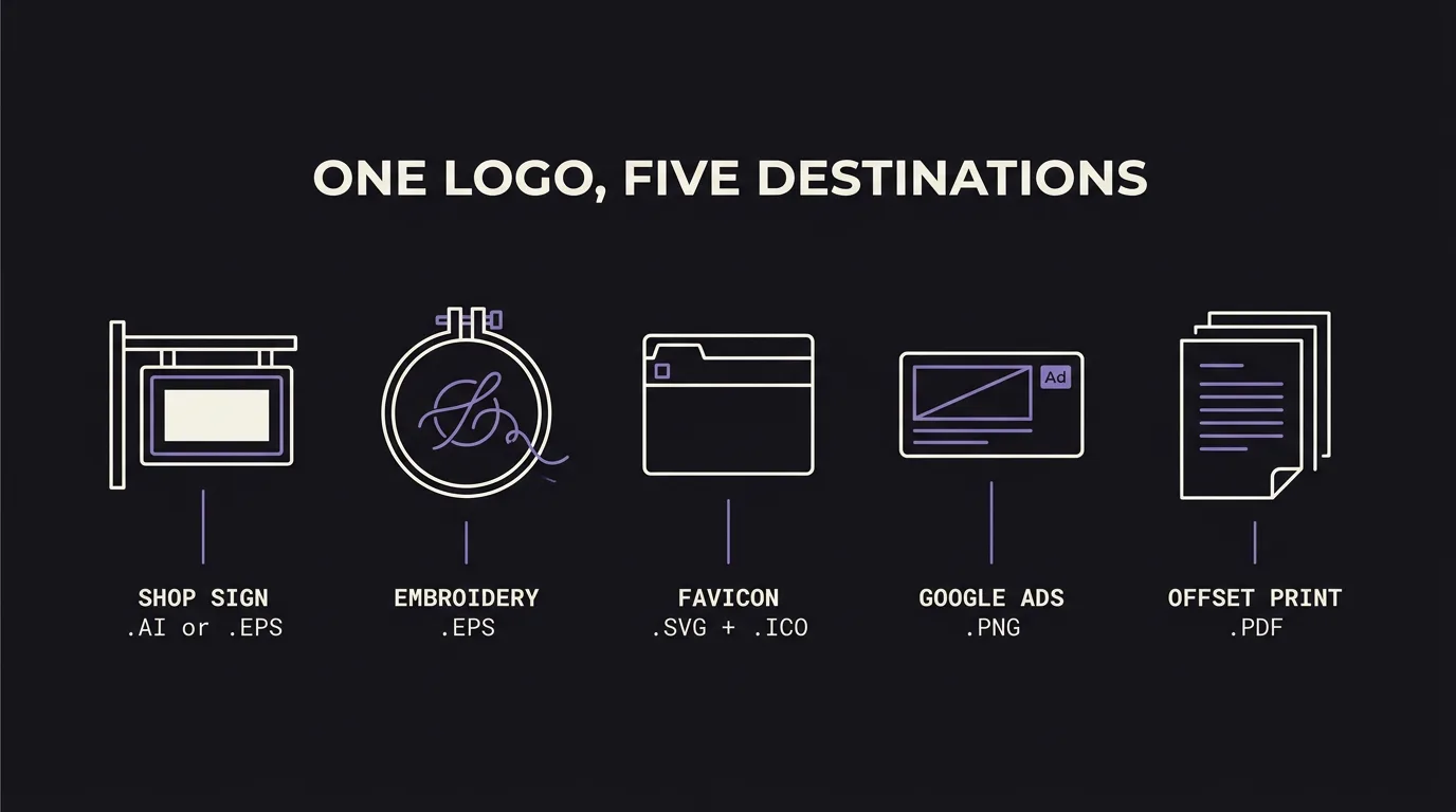
This is the table to keep. The last column is the sentence to paste into your brief or your email to the designer — the exchange usually goes wrong because the request was “send me the logo”, not because anyone was being difficult.
| Deliverable | Ask for | Also send | The line to put in the brief |
|---|---|---|---|
| Shopfront or vehicle sign | .eps or .ai, vector | .pdf | “Vector EPS with all text converted to outlines, at 1:1 or any scale” |
| Embroidery — polos, caps | .eps vector + Pantone codes | .png for reference | “Vector EPS plus thread colour references; flag any line under 1 mm or lettering under 4 mm” |
| Screen print, T-shirts | .eps vector, colours separated | — | “Vector with each print colour on its own layer, spot colours named” |
| Offset or litho print | .pdf (PDF/X), CMYK | .ai | “Press-ready PDF, CMYK, fonts outlined, 3 mm bleed” |
| Laser cut or engraving | .svg or .eps, paths only | — | “Single-colour vector, text outlined, cut lines as closed hairline paths with no fill” |
| Website logo | .svg | .png at 2× | “SVG with no embedded images, plus a 2× PNG fallback” |
| Favicon and app icon | .svg + .ico | .png 512 px | “Simplified icon-only mark that still reads at 16 px” |
| Google Ads and paid social | .png, transparent | .jpg for photo units | “PNG on transparent background, 1200 px on the long edge minimum” |
| Presentations and decks | .png transparent | .svg | “Transparent PNG at 1000 px wide, plus a white-on-dark version” |
| Email signature | .png, small | — | “PNG under 20 KB, 400 px wide, on a white background” |
Two details in that table do more work than the format names, and both get skipped:
Convert text to outlines. A vector file that still references a font will re-render in whatever the supplier has installed. That is how a carefully chosen typeface becomes Arial on the front of a building. Outlining turns the letters into shapes — uneditable, which is the point.
Name your colours, do not just show them. A screen looks at RGB, a press mixes CMYK, and an embroidery machine picks a thread from a physical chart. Sending a file without Pantone or thread references means someone else picks your brand colour, on their monitor, under their lighting.
The ten-second test for whether a file is really vector
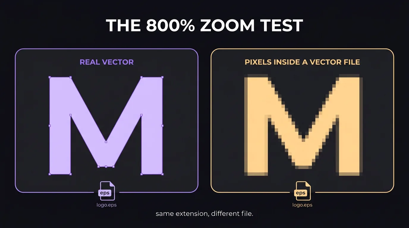
The extension tells you what the container is, not what is inside it. PDF, AI, EPS and SVG can all hold raster images — a designer who exports a JPEG and saves it into an EPS produces a file that passes a name check and fails at the sign shop. Run these in order; the first one catches almost everything.
- Zoom to 800%. Open the file in any preview and magnify a curved edge or the corner of a letter. Vector edges stay razor sharp at any magnification. If the edge softens or stair-steps into squares, there is a raster image inside.
- Look at the file size. A vector logo is instructions, not pixels, so an SVG or an exported PDF of one is usually well under 1 MB and often under 100 KB. A 12 MB SVG is a photograph wearing a costume. Judge AI and EPS files more gently: both carry an embedded preview image and Illustrator writes PDF-compatible data alongside its own, so a simple logo can legitimately weigh a few megabytes. Size is a prompt to run check 1, not a verdict on its own.
- For SVG, open it in a text editor. An SVG is plain text. Real vector content appears as
<path>,<circle>or<polygon>elements. If you find<imageor a long block ofbase64gibberish, a bitmap has been embedded and you have an SVG-shaped PNG. - Click a shape. In any vector editor, selecting part of a true vector reveals anchor points along the outline. If the whole artwork selects as one rectangle with a bounding box and no nodes, it is a placed image.
There is a fifth check worth doing once: ask the supplier. Sign makers and printers do this triage every day and will tell you in a minute whether what you sent is usable. It is a free second opinion and it happens before the deadline rather than during it.
What a complete logo package contains, and what to reject on delivery
Most logo disputes are not about the design. They are about what was handed over at the end, discovered eighteen months later when the designer has moved on. Check the package on the day it arrives, while the relationship is still warm and the revision round is still open.
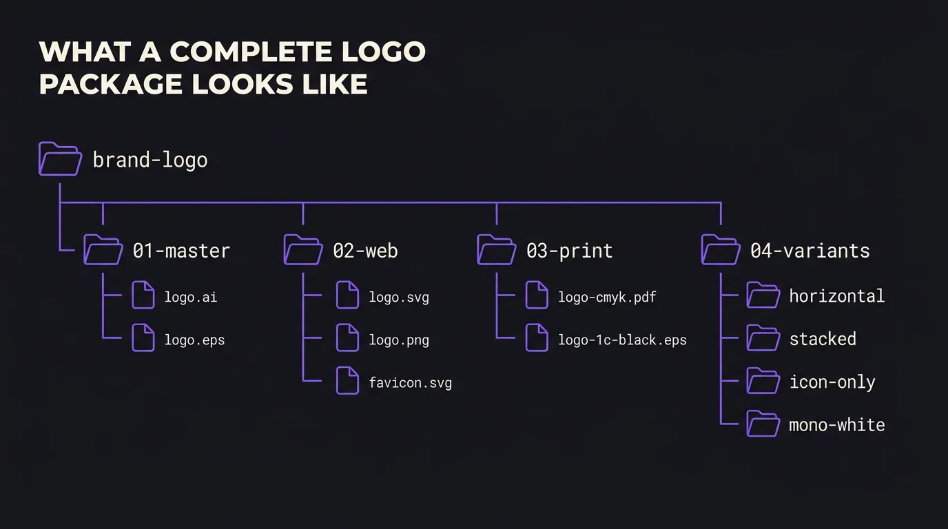
Accept when all of this is present:
- An editable master —
.aior layered.eps, with live paths, not flattened. - Fonts resolved — either outlined, or the font files named so you can license them yourself.
- Web set —
.svgwith no embedded bitmaps, plus.pngexports on transparent backgrounds. - Print set — a CMYK
.pdfand a one-colour black version. The black version is what gets used for stamps, engraving, faxed forms and single-colour merch, and it is the file nobody remembers to ask for. - Colour specification — hex for screen, CMYK breakdown for print, Pantone for anything physical.
- Lock-up variants — horizontal, stacked, icon-only, and a reversed version for dark backgrounds.
- Clear-space and minimum-size rules — even one page. It stops the logo being squeezed into a 40 px header where the wordmark disappears.
Reject, and ask again, when:
- The only files are PNG or JPEG, at any resolution.
- The vector file fails the zoom test above.
- Everything is in one square lock-up with no icon-only or horizontal variant.
- The file names are
logo-final-v3-USE-THIS.ai. Naming is not cosmetic — in two years it is the only documentation you will have.
The package is a deliverable in its own right. It belongs in the scope you agree at the start, not in a hopeful email after the invoice. Our graphic design services hand over the full set as standard, because the alternative is being called back a year later to rebuild a logo from a screenshot.
Raster resolution: the only number that matters when vector is not an option
Photographs cannot be vector, so the question changes from “which format” to “how many pixels”. The rule of thumb: 300 pixels per inch at final printed size for anything held in the hand, and progressively less as the viewing distance grows — around 150 for a roll-up banner, as low as 15 for a billboard — because a billboard is read from 50 metres, not 50 centimetres.
Turn that into pixels before you commission the photo, not after:
| Final use | Printed size | Pixels needed |
|---|---|---|
| Business card image | 50 × 50 mm | 600 × 600 |
| A5 flyer, full bleed | 148 × 210 mm | 1750 × 2480 |
| A4 brochure page | 210 × 297 mm | 2480 × 3508 |
| Roll-up banner | 850 × 2000 mm | 5020 × 11810 at 150 dpi |
| Website hero | — | 2560 px wide, 1× |
| Social post | — | 1080 × 1080 minimum |
An image can always go down in size without loss. It can never go up. That asymmetry is the whole reason to shoot and store bigger than you currently need — and the reason “just enlarge it” is not a request a designer can fulfil, only one they can fake.
Where vector quietly loses: photographs, gradients and stitch counts
Vector is not the better format. It is the right format for a specific class of artwork, and pretending otherwise creates its own problems.
- Photographs. A photo is millions of unrepeating colour values. Describing that mathematically produces a file larger and slower than the JPEG it replaced, and it will still look like a poster of a photo rather than a photo.
- Soft gradients and effects. Blurs, drop shadows and mesh gradients either rasterise silently on export or bloat the file. A logo that depends on a gradient to work is a logo that will be redrawn the first time it goes on a one-colour surface.
- Fine detail at small physical sizes. Embroidery cannot stitch a hairline. A line much under 1 mm closes up as the thread lands, and lettering under about 4 mm becomes a smudge. This is why brands with intricate marks keep a simplified variant — it is not laziness, it is what the machine can physically do. Worth knowing before the first order: your vector is not what the machine reads. The embroiderer digitises it into a stitch file — DST, PES or EMB — and that file is usually theirs, billed as a one-off setup. Ask who owns it, because moving supplier without it means paying to digitise the same logo twice.
- Web performance, sometimes. An SVG with thousands of nodes — usually the output of an automatic trace — can render slower than a compressed PNG of the same thing. Complexity has a cost even in vector.
The working rule: vector for anything drawn, raster for anything captured. Most brand systems need both, and the failure is not choosing wrong, it is only having one of them.
The file extensions you will actually be handed, and what each one really is
Logo file format questions almost always come down to this list. Column three is the one that matters: what happens when a supplier opens it.
| Extension | Type | What it actually is |
|---|---|---|
.ai | Vector | Illustrator’s working file. The editable master. Keep it, rarely send it. |
.eps | Vector container | Legacy in prepress, but still what suppliers ask for by name. Can contain raster — test it. |
.svg | Vector | Web-native, plain text, editable. Can embed bitmaps — test it. |
.pdf | Either | Vector if generated from vector, raster if generated from a scan. Ask which. |
.png | Raster | Lossless, supports transparency. The default for screens and ads. |
.jpg | Raster | Lossy, no transparency. Right for photographs, wrong for logos and type. |
.tif | Raster | Large, lossless, print heritage. High quality, still a fixed size. |
.webp | Raster | Smaller than PNG or JPEG at similar quality. Web only; some print tools reject it. |
.gif | Raster | 256 colours, animation. Legacy — avoid for anything brand-facing. |
.ico | Raster | Multi-size icon container for browser favicons and Windows. |
Two entries deserve the extra caution. PDF is the format that hides the answer most often, because a scanned page and an exported illustration produce the same extension and open the same way. And EPS is the one most often faked, because it is what suppliers ask for by name, so it is what people generate however they can.
Three lines in the design brief that end the format conversation
Format problems are brief problems that surfaced late. Deciding where the artwork ends up, before anyone opens a design tool, removes almost all of them — the same principle behind everything else in a design brief.
Three lines are enough:
- “Final deliverables include an editable vector master, a web set and a print set, with all text outlined.” This is the line that makes the handover contractual rather than optional.
- “The mark must remain legible at 16 px and at 3 m.” One sentence that forces a simplified variant to exist, because no single lock-up satisfies both ends.
- “Confirmed uses: [sign / embroidery / packaging / ads / merch].” Naming the physical destinations up front lets the designer resolve stroke weights, minimum sizes and colour systems while it is still cheap to change them.
None of that requires knowing anything technical. It requires deciding, early, where the logo is going — which is a business question, not a design one, and the reason it is worth answering before the first sketch.
09 / Reader questions
Frequently asked questions
01What is the difference between vector and raster images?
A raster image is a fixed grid of coloured pixels, so it has one native size and blurs when enlarged beyond it. A vector image stores shapes as mathematical paths and redraws them at any size without losing an edge. Photographs are raster by nature; logos, icons and type should be vector.
02Is a JPEG a raster or vector image?
A JPEG is always raster. So are PNG, GIF, TIFF, WEBP, HEIC and every photo your phone takes. Renaming a JPEG to .eps or placing it inside an Illustrator file does not make it vector — the pixels are still pixels, just wrapped in a different container.
03Is a PNG a vector image?
No. A PNG is a raster format with transparency support, which is why it is often mistaken for a vector file. Transparency and vector are unrelated: a PNG with a transparent background is still a fixed grid of pixels and still blurs when scaled past its native size.
04Is a TIFF file raster or vector?
TIFF is raster. It is an uncompressed or losslessly compressed pixel format used in print production, so the files are large and the quality is high, but the size is still fixed. A TIFF cannot be enlarged for a billboard any more safely than a JPEG can.
05What file format should a logo be?
The master logo should be vector — AI or EPS from the designer, plus SVG for the web. Everything else is exported from that master: PNG for screens and ads, PDF for print suppliers, SVG plus ICO for a favicon. If your only logo file is a PNG or JPEG, you do not have a master.
06Can you convert a raster image to vector?
You can trace it, but tracing is a redraw, not a conversion. Automatic tracing produces wobbly curves and hundreds of stray nodes that show up at sign size; manual redrawing by a designer is accurate but is billable work. Either way the result is a new file that needs approving against the original.