Published
YouTube’s banner spec is 2560 x 1440 pixels, 16:9, 6MB or smaller, with a published minimum of 2048 x 1152. Only the central band of that file survives everywhere: 1546 x 423 pixels, which is 17.7% of what you upload. The remaining 82% is shown or discarded depending on the screen.
That is the whole problem in one line. A YouTube banner is not one image at one size. It is one image at four sizes, and only the smallest one is guaranteed.
How this was checked. The specification figures are quoted from YouTube’s own channel branding Help page, retrieved 24 August 2026. The per-device crop dimensions are not on that page — they trace to YouTube’s channel-art template and are labelled as such wherever they appear below. The arithmetic in this article — area shares, aspect ratios, insets — is ours, and can be recomputed from the two published canvases in a few seconds. The file-weight numbers come from test exports we generated and measured the same day; the method sits in that section. Search volumes are Google Keyword Planner figures for the United States, retrieved 24 August 2026.
The banner spec YouTube publishes, and the one number it leaves out
Six bullets, four of them numbers, and that is the entire published specification for the image itself.
| What YouTube publishes | Figure |
|---|---|
| Recommended dimension, especially for TV | 2560 x 1440 px |
| Minimum dimension for upload | 2048 x 1152 px, aspect ratio 16:9 |
| Safe area for text and logos, at the minimum dimension | 1235 x 338 px |
| File size | 6 MB or smaller |
The two bullets without numbers do more work than the four with them. One is a rule about the artwork: “Do not include any additional file embellishments (e.g. shadows, borders, and frames).” The other is the specification’s honest admission: “Images should accommodate the entire screen for larger devices but will get cropped on certain views and devices.”
That second sentence names the behaviour and publishes none of its numbers. There is no table of what a television shows against what a phone shows, no per-device pixel figure, no diagram. The one concession is the safe area, and — as the next section shows — even that is quoted against a canvas most people are not using.
The embellishment rule is easy to break by accident and worth taking literally. A drop shadow under a logo, a keyline around the artwork, a border added to make the banner feel contained: YouTube reads all three as part of the image, and the crop behaviour above is why they fail. A frame that neatly encloses a 16:9 composition has its left and right sides sliced off on a phone, leaving two orphaned vertical lines.
One smaller gap is worth knowing before you start. The accepted file formats are published next to the profile picture, not next to the banner: JPG, GIF, BMP or PNG, no animated GIFs. Treat that as the safe set for both, but note that most guides present it as a banner specification when it is not written as one.
Two published safe-area numbers, 1546 x 423 and 1235 x 338, one region
Search the head term and you will find both figures in circulation, presented as if one of them is out of date. Neither is. They describe the same band on two different canvases.
Here is the arithmetic. The gap between the two published canvases is a factor of 1.25 — 2560 divided by 2048, and 1440 divided by 1152. Apply it to the current safe-area figure:
- 1235 x 1.25 = 1543.75
- 338 x 1.25 = 422.5
Round those and you get 1544 x 423 against the legacy figure of 1546 x 423. Two pixels of width apart, on a canvas 2560 pixels wide. They are the same region, expressed against the minimum upload in one case and the recommended upload in the other.
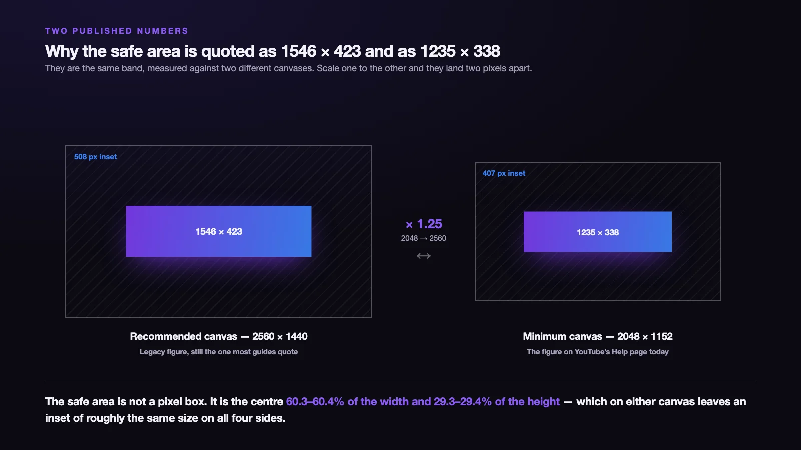
The useful form is neither pixel figure. The safe area is the centre 60.3–60.4% of the frame’s width and 29.3–29.4% of its height. The lower end of each range is 1235 x 338 measured against 2048 x 1152; the upper end is 1546 x 423 measured against 2560 x 1440. Hold it as a proportion and it converts to any canvas you happen to be working on without a second lookup.
One property falls out of those proportions and is worth keeping, because it makes the box trivial to draw by hand. On a 2560 x 1440 canvas the vertical margin is (1440 − 423) ÷ 2 = 508.5 pixels. The horizontal margin is 507 if you take the legacy 1546 and 508 if you take the scaled 1544 — the same two pixels of disagreement, seen from the other side. Either way, the safe area is an inset of roughly 508 pixels from every edge. On the 2048 x 1152 minimum the same construction gives 406.5 and 407 — again, effectively uniform. Whether YouTube designed it that way or it fell out of the rounding, it means you can set one guide value in any editor instead of four.
Also note what the safe area is not. It is not a suggestion about composition, and it is not a margin for aesthetic breathing room. It is a statement about a crop: the box is the smallest slice any device takes.
One file, four crops: what a TV, a desktop, a tablet and a phone each show
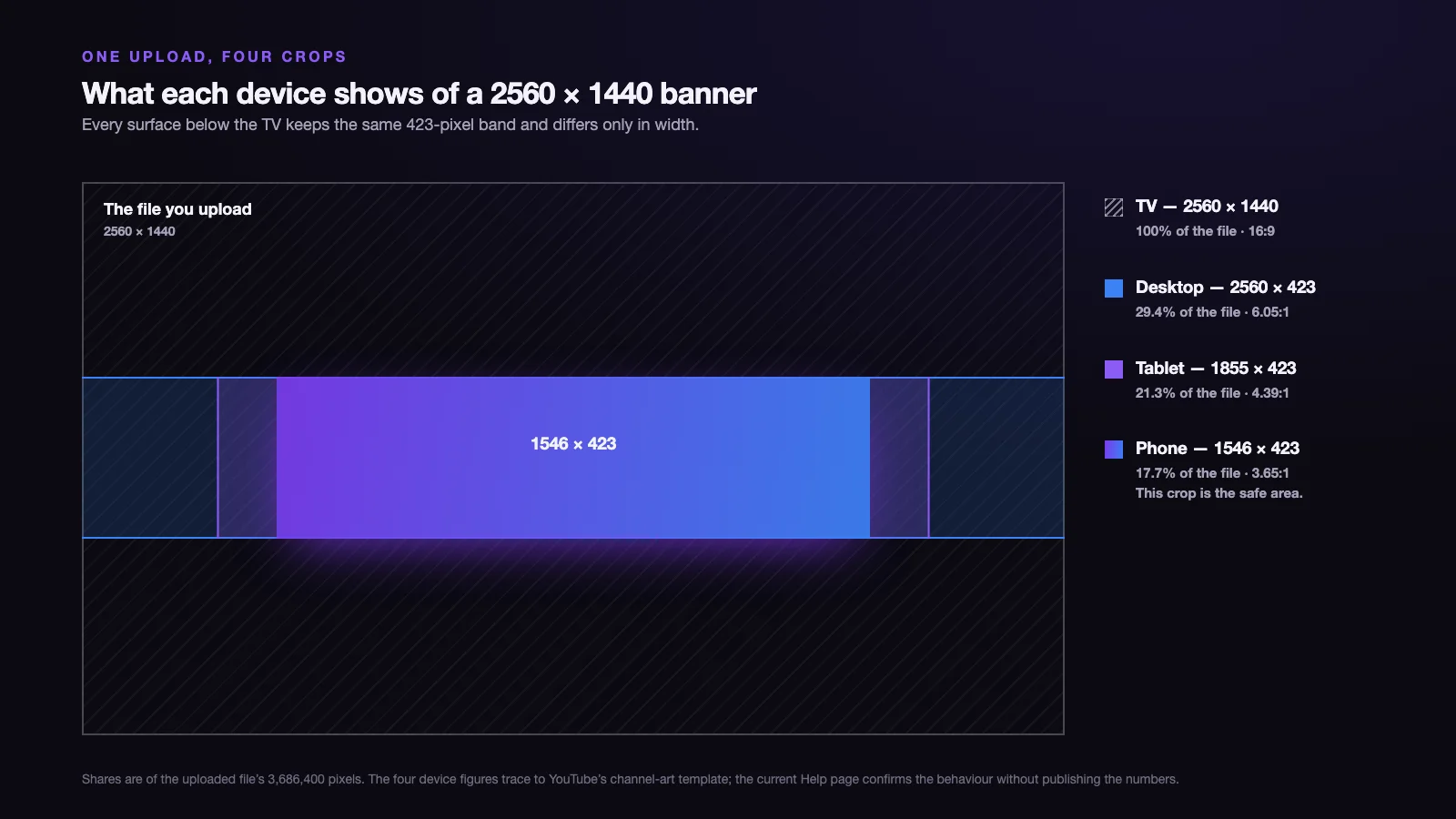
The four figures below are the ones missing from the Help page. They come from YouTube’s channel-art template rather than from current documentation, and should be read as the well-established convention they are rather than as a live specification. The shares and ratios in the last two columns are ours, computed against a 2560 x 1440 upload.
| Surface | Region of your file shown | Share of the file | Shape of what is shown |
|---|---|---|---|
| Television | 2560 x 1440 | 100% | 16:9 |
| Desktop, wide window | 2560 x 423 | 29.4% | 6.05 : 1 |
| Tablet | 1855 x 423 | 21.3% | 4.39 : 1 |
| Phone | 1546 x 423 | 17.7% | 3.65 : 1 |
Three things in that table decide everything downstream.
The phone crop and the safe area are the same box. 1546 x 423 appears twice, and that is not a coincidence — it is the definition. The safe area is not an independent rule with its own logic; it is simply the smallest crop, given a name. Once you see that, the safe area stops being an arbitrary rectangle to memorise and becomes the obvious consequence of a phone being narrow.
Every non-TV surface keeps the same 423-pixel height. The crops differ in width only. Vertical composition is therefore settled once, for all three of them, and the only variable across desktop, tablet and phone is how much of your width survives — 100%, 72.5% and 60.4% respectively.
One file has to work as four different shapes. A 16:9 frame on the television, then strips at 6.05:1, 4.39:1 and 3.65:1. The television is the outlier, not the phone: it is the only surface that sees your composition as the rectangle you designed.
Designing one asset that is re-cropped per surface is not unique to YouTube — Meta’s ad placements do the same thing to a single creative, and the mechanics of that are laid out in Facebook ad sizes. What makes the banner harder is the range. Meta’s crops stay within a family of similar shapes; YouTube asks the same pixels to read as a 16:9 image and as a 6:1 letterbox strip.
Designing for 17.7% of your own file
If the safe area is the only guaranteed region, the composition rules follow mechanically.
Everything that must be read goes inside 1546 x 423. Channel name, logo, tagline, upload schedule, handle. Not near the edge of it — inside it, with its own margin, because the band’s edges are exactly where the phone’s crop falls, and a letterform touching that line is a letterform cut in half.
The 82% outside is atmosphere, not information. Treat it as extension: colour field, texture, a continuation of the artwork that makes the television view feel composed. Anything load-bearing placed out there is a message some of your audience will never receive.
Vertical centring is not optional. The band sits dead centre of the frame, a little over 508 pixels down from the top. A design weighted towards the upper third looks balanced in your editor and is decapitated on every device except a television.
Check the design at the widest crop, not just the narrowest. The 2560 x 423 desktop strip is the view most people meet first, and it has the opposite failure mode to the phone: a layout built tightly around the safe area leaves two large empty flanks on a wide monitor. The band is where the content goes; the flanks still have to look deliberate.
Two related questions come up constantly at this point and both have their own answers elsewhere. The pixel spec for video thumbnails is a different file with different rules, and the shape a video itself should be shot and delivered in is a third problem again — the crop arithmetic there works nothing like the crop behaviour here, because a thumbnail is scaled down rather than sliced. Those are separate articles on this blog rather than sections of this one.
The plain black banner, and why so many people search for one
This is the strangest thing in the keyword data. Alongside youtube banner size at 22,200 searches a month sit youtube banner size black at 18,100 and youtube banner size black background at 12,100. Those two colour variants together are on the same order as the head term itself. A very large share of everyone asking about banner dimensions is not asking about design at all — they want an empty canvas in a solid colour, at the right size, now.
There is a real reason, and it is the same reason this article exists. A solid field has no crop seam. Every crop of a uniform colour is identical to every other crop, so the four-shapes problem disappears entirely. A black banner cannot be badly cropped on a phone, because there is nothing in it to lose. It is the one design that is guaranteed to look the same on a television and in a thumb-sized mobile header.
The second reason is the interface around it. YouTube’s dark theme is a near-black surface, so a black banner reads as no banner at all — the channel header appears to start at the avatar. That is a deliberate look, and it is a defensible one for a channel whose identity lives in its thumbnails rather than its header.
The honest counterpoint: it only holds in one theme. In YouTube’s light theme a pure black banner becomes a hard black slab against white, which is the loudest possible version of the design you were trying to make quiet. If invisibility is the goal, a very dark neutral rather than #000000 survives both themes better.
Three templates at the correct 2560 x 1440, free to download:
- Guide template with the safe area marked — 2560 x 1440 PNG with the phone, tablet and desktop crop boundaries drawn on it. Drop it into your editor as a top layer, design underneath it, hide it before export.
- Plain black banner — 2560 x 1440, solid #000000, 11KB.
- Plain white banner — 2560 x 1440, solid #FFFFFF, 14KB.
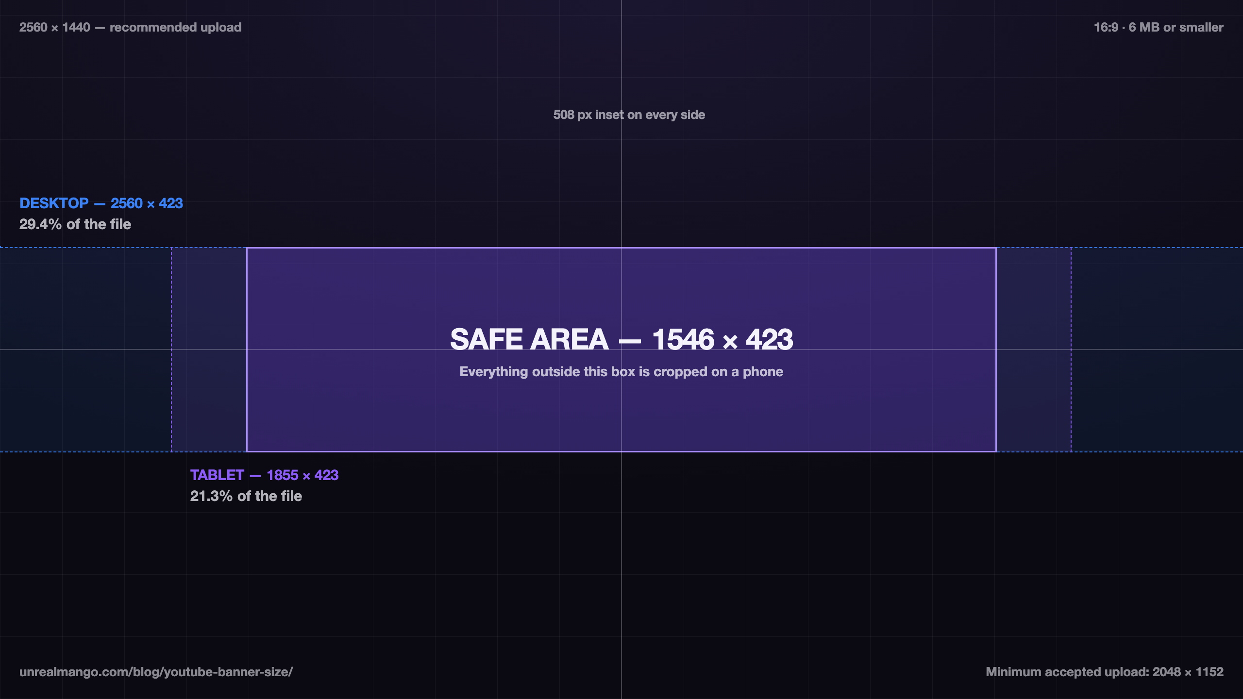


The black and white files are ready to upload exactly as they are. The guide template is not a banner — it is a working overlay, and it carries a URL across the bottom. All three are far under the 6MB ceiling.
Getting a 2560 x 1440 banner under the 6 MB ceiling
The weight limit is where most uploads fail, and the cause is nearly always the export format rather than the dimensions.
The measurement. We generated two 2560 x 1440 test files on 24 August 2026: a flat two-colour graphic, and a smooth colour gradient with added grain standing in for photographic content. Each was saved as 24-bit PNG and as JPEG at quality 85 with no chroma subsampling, then weighed on disk.
| Test file | As 24-bit PNG | As JPEG, quality 85 |
|---|---|---|
| Flat two-colour graphic | 14 KB | 114 KB |
| Gradient with grain (photographic) | 6.82 MB | 0.66 MB |
Read the bottom row first. A photographic banner saved as PNG exceeded YouTube’s 6MB limit on its own, before any type, logo or texture was added on top. The same image as JPEG at quality 85 came in at a tenth of that, with nothing a viewer could see missing at any size a banner is drawn.
The top row is the mirror image, and it is why “always use JPEG” is the wrong lesson. For flat colour and hard-edged shapes, PNG was eight times lighter than JPEG, and lossless besides — JPEG spends bytes inventing detail in areas that have none, and leaves ringing artefacts along sharp edges.
So the rule is about content, not about the platform:
- Flat colour, solid fields, hard-edged type and shapes → PNG. It will be tiny.
- Photography, gradients, renders, anything with continuous tone → JPEG at quality 82–88. Comfortably under the ceiling with no visible cost.
- A mix of both → JPEG. The photographic content dominates the file size, and a single sharp logo survives quality 85 without complaint.
If a JPEG at quality 85 still will not fit, the problem is not compression. Check that the canvas is actually 2560 x 1440 and not something larger left over from a print template — that is the other common cause, and reducing quality to fix it degrades the image for no reason.
The profile picture and watermark that sit beside the banner
The banner is one of three images in YouTube’s channel branding panel, and the other two have their own published figures.
| Asset | What YouTube publishes |
|---|---|
| Profile picture | Renders at 98 x 98 px, 15 MB maximum, JPG / GIF / BMP / PNG, no animated GIFs |
| Video watermark | Square, minimum 150 x 150 px, under 1 MB |
| Banner | 2560 x 1440 recommended, 2048 x 1152 minimum, 6 MB maximum |
One correction worth making, because it appears in nearly every guide on this topic. YouTube does not publish an upload resolution for the profile picture. The 800 x 800 figure you will see quoted everywhere is convention, not specification: what YouTube publishes is the render size of 98 x 98 and a 15MB ceiling. 800 x 800 is a sensible convention — square, comfortably above the render size, generous headroom for future interface changes — but it is worth knowing which of the two numbers is actually binding.
The practical consequence of the render size is harsher than the upload size ever was. A picture drawn at 98 x 98 and masked to a circle has room for a mark, a letterform, or a face at close crop. It has no room for a wordmark, a tagline, or a logo with a strapline underneath. If the channel’s identity depends on text, that text belongs in the banner’s safe area, where it has 1546 x 423 to live in.
Keeping the three consistent — the mark at 98 pixels, the same mark inside the banner band, the same colour field behind both — is ordinary brand system work rather than a YouTube problem, and the way to lock it down is the same as anywhere else: decide the rules once and write them down, as in these brand guidelines examples.
A five-check pass before you upload
- Canvas is exactly 2560 x 1440, RGB. Not larger, not a print template, not 1920 x 1080 scaled up. If the file is below 2048 x 1152 it will be refused.
- Draw the roughly 508-pixel inset and put everything readable inside it. Name, logo, handle, schedule. The guide template linked above does this for you as an overlay layer.
- Crop the design to 1546 x 423 and look at only that. This is the phone view and the majority view. If it does not communicate on its own, the banner does not work — no amount of artwork in the outer 82% will rescue it.
- Crop to 2560 x 423 and look again. This is the desktop strip. Check that the flanks either side of the safe area read as intentional rather than empty.
- Export by content type, then weigh the file. PNG for flat graphics, JPEG at quality 82–88 for anything photographic, and confirm the result is under 6MB before you open YouTube Studio.
Step 3 is the one that changes results, and it is the one almost nobody does. Judging a banner at full size is judging a view that only television viewers get. The 1546 x 423 crop takes thirty seconds to make and is the version most of your audience will actually see.
If the banner is one piece of a larger identity rollout rather than a standalone asset, the sequencing matters more than the pixels: settle the mark, the colour and the type first, then produce every surface from those decisions at once. Writing that down before anyone opens an editor is what a design brief is for, and it is how our graphic design work starts on a channel refresh — one set of decisions, applied to the banner, the avatar, the watermark and the thumbnails in a single pass rather than four.
09 / Reader questions
Frequently asked questions
01What size is a YouTube banner?
2560 x 1440 pixels at a 16:9 ratio, 6MB or smaller. YouTube's published minimum accepted upload is 2048 x 1152 pixels, also 16:9. The same file is used on televisions, computers, tablets and phones, and each of those crops it differently, so the dimensions are only half the answer — the central safe area is the other half.
02What is the YouTube banner safe area?
The central 1546 x 423 pixels of a 2560 x 1440 file. YouTube's Help page currently states it as 1235 x 338, which is the same region measured against the 2048 x 1152 minimum canvas rather than the 2560 x 1440 recommendation. Scale either figure to the other canvas and the two land within two pixels of each other.
03What is the YouTube banner size for mobile?
1546 x 423 pixels, which is the same box as the safe area. A phone shows the narrowest crop of the banner, so anything outside that centre band is invisible on mobile. This is why the safe area exists at all: it is defined by the smallest crop rather than by a separate rule.
04What is the YouTube banner aspect ratio?
The file is 16:9, but the crops are not. A television shows the full 16:9 frame; a desktop browser shows a 6.05:1 strip, a tablet a 4.39:1 strip and a phone a 3.65:1 strip. One upload has to work as four different shapes, which is the real design constraint behind the dimensions.
05Why does my YouTube banner look cropped or zoomed in?
Because it is cropped — by design, and differently on every device. YouTube uses one image across TV, computer and mobile displays and takes a narrower slice of it as the screen gets smaller. A banner that looks correct on your desktop will lose roughly 40% of its width on a phone unless the important content sits inside the central 1546 x 423 band.
06What is the YouTube banner size in inches?
There is no fixed answer, because the banner has no physical size until a screen draws it. If you need a print-style canvas, 2560 x 1440 pixels at 300 DPI is 8.53 by 4.8 inches, and the same pixels at 72 DPI are 35.6 by 20 inches. DPI has no effect on the file YouTube receives, so set the canvas in pixels and ignore inches.
07Why won't my YouTube banner upload?
Almost always the 6MB file-size ceiling, and almost always because the export was a PNG. A 2560 x 1440 photographic image saved as 24-bit PNG measured 6.82MB in our test — over the limit on its own, before any design was added. Re-exporting the same canvas as JPEG at quality 85 brought it to 0.66MB. The second cause is a file below the 2048 x 1152 minimum.